
[This work is based on this course: Google Data Analytics Professional Certificate.]
Cyclistic is a fictional bike-share company located in Chicago. Since its foundation in 2016, Cyclistic has since grown to a fleet of 5,824 bicycles. This bicycles are geotracked and locked into a network of 692 stations across Chicago. Every one of them can be unlocked from one station and returned to any other station anytime. Cyclistic has 3 flexible pricing plans: single-ride passes, full-day passes, and annual memberships. Customers who purchase single-ride or full-day passes are referred to as casual riders. Customers who purchase annual memberships are Cyclistic members.
The company wants to increase revenue with a new marketing strategy to convert casual riders into annual members. Therefore I am tasked with analysing bike usage data to understand how casual riders and annual members use Cyclistic bikes differently, to help create a data driven marketing strategy.
In particular, I am interested in the following:
- How many members and casuals customers do we have? What are their proportions of total trips?
- Calculate the average ride lengths for members and casuals respectively.
- Calculate the most common starting and ending stations for casuals and members respectively.
- Are there something relevant on any days of the week by category?
- Can we see any preference for the rideable type for casuals and members?
The data used for this analysis was collected by Cyclistic, and pertains to rider patterns over the past twelve months from September 2020 to August 2021.
The data has been obtained from the following source. The data has been made available by Motivate International Inc. under this license.) This is public data that we can use to explore how different customer types are using Cyclistic bikes.
Features of the dataset:
-
ride_id: Unique ID per ride
-
rideable_type: Type of bicycle used
-
started_at: Date and time that the bicycle was checked out
-
ended_at: The date and time that the bicycle was checked in
-
start_station_name: Name of the station at the start of the trip
-
start_station_id: Unique identifier for the start station
-
end_station_name: Name of the station at the end of the trip
-
end_station_id: Unique identifier for the end station
-
start_lat: Latitude of the start station
-
start_lng: Longitude of the start station
-
end_lat: Latitude of the end station
-
end_lng: Longitude of the end station
-
member_casual: Member or a casual user
Fields we added during the analysis:
-
ride_length: Length of the ride calculated as ended_at – started_at.
-
day_of_week: Day of the week for started_at
For this case study, the datasets are appropriate and will enable to answer the business questions. The data has been made available by Motivate International Inc. under this license.) This is public data that we can use to explore how different customer types are using Cyclistic bikes. But note that data-privacy issues prohibit you from using riders’ personally identifiable information. This means that we won’t be able to connect pass purchases to credit card numbers to determine if casual riders live in the Cyclistic service area or if they have purchased multiple single passes.
Steps:
1- Excel:
Initially I’ve used Excel for cleaning and processing each .csv file. I’ve created a column called ‘ride_length’. Calculate the length of each ride by subtracting the column “started_at” from the column “ended_at” (for example, =D2-C2) and format as HH:MM:SS using Format > Cells > Time > 37:30:55.
I’ve also build a column called ‘day_of_week’ and calculate the day of the week that each ride started using the ‘WEEKDAY’ command (for example, =WEEKDAY(C2,1)) in each file. Format as General or as a number with no decimals, noting that 1 = Sunday and 7 = Saturday.
I have also created three pivot tables in each csv:
- The first pivot table represent the average ride length by each type of member per month.
- The second pivot table represent the total average ride length per month.
- The third table shows the number of daily trips by day of week and month.
- The fourth table the number of total daily trips by month.
2- Tableau:
I have used Tableau to graphically represent the 4 pilot tables created in the excel files. You can see them here, in the Tableau tab or in the following links:
2- RStudio:
I have used RStudio for almost all the manipulation. I have also used the sqldf library to make SQL queries and show them later. Such as maps with the Top 5 stations for the end and start of the journey, Total rides per day of week and total rides per rideable type.
1- Libraries
library("tidyverse")
library("lubridate")
library("rgdal")
library("markdown")
library("maps")
library("sqldf")
library("ggrepel")
library("sp")
2- Extraction and Manipulation dataframes:
-Reading and creating dataframes for each .csv:
setwd("/home/Documents/Google_course/tripdata_2020_09_2021_08_xml/")

sep_20 <- read.csv("202009-divvy-tripdata.csv", sep=",")
oct_20 <- read.csv("202010-divvy-tripdata.csv", sep=",")
nov_20 <- read.csv("202011-divvy-tripdata.csv", sep=",")
dec_20 <- read.csv("202012-divvy-tripdata.csv", sep=",")
jan_21 <- read.csv("202101-divvy-tripdata.csv", sep=",")
feb_21 <- read.csv("202102-divvy-tripdata.csv", sep=",")
mar_21 <- read.csv("202103-divvy-tripdata.csv", sep=",")
apr_21 <- read.csv("202104-divvy-tripdata.csv", sep=",")
may_21 <- read.csv("202105-divvy-tripdata.csv", sep=",")
jun_21 <- read.csv("202106-divvy-tripdata.csv", sep=",")
jul_21 <- read.csv("202107-divvy-tripdata.csv", sep=",")
aug_21 <- read.csv("202108-divvy-tripdata.csv", sep=",")
-Merging all dataframes:
df <- do.call("rbind", list(sep_20, oct_20, nov_20, dec_20, jan_21, feb_21, mar_21, apr_21, may_21, jun_21, jul_21, aug_21))

View(head(df))
| ride_id | rideable_type | started_at | ended_at | start_station_name | start_station_id | end_station_name | end_station_id | start_lat | start_lng | end_lat | end_lng | member_casual | ride_length | day_of_week | ride_length_min | |
|---|---|---|---|---|---|---|---|---|---|---|---|---|---|---|---|---|
| 1 | F436C1376E544CA4 | docked_bike | 2020-09-01 00:00:07 | 2020-09-01 00:37:30 | Michigan Ave & Lake St | 52 | Michigan Ave & Lake St | 52 | 41.886024 | -87.624117 | 41.886024 | -87.624117 | casual | 00:37:23 | 3 | 37,3833333333333 |
| 2 | 4BDBF1871364E2C7 | docked_bike | 2020-09-01 00:00:19 | 2020-09-01 00:16:13 | Broadway & Wilson Ave | 293 | Broadway & Berwyn Ave | 294 | 41.965221 | -87.658139 | 41.978353 | -87.659753 | member | 00:15:53 | 3 | 15,9 |
| 3 | 0392A0D6FB466576 | electric_bike | 2020-09-01 00:00:33 | 2020-09-01 00:04:43 | Wells St & Evergreen Ave | 291 | State St & Pearson St | 106 | 41.9066971666667 | -87.6351238333333 | 41.8976816666667 | -87.6288231666667 | casual | 00:04:09 | 3 | 4,16666666666667 |
| 4 | 8684AF4D002CB59E | docked_bike | 2020-09-01 00:00:41 | 2020-09-01 00:16:21 | Broadway & Wilson Ave | 293 | Broadway & Berwyn Ave | 294 | 41.965221 | -87.658139 | 41.978353 | -87.659753 | casual | 00:15:39 | 3 | 15,6666666666667 |
| 5 | 8240E1D13E461357 | docked_bike | 2020-09-01 00:02:07 | 2020-09-01 00:15:53 | Shore Dr & 55th St | 247 | Ellis Ave & 60th St | 426 | 41.795212 | -87.580715 | 41.78509714636 | -87.6010727606 | member | 00:13:46 | 3 | 13,7666666666667 |
| 6 | ED3F7E1B5B1CBA23 | electric_bike | 2020-09-01 00:02:31 | 2020-09-01 00:06:31 | Benson Ave & Church St | 596 | Dodge Ave & Church St | 600 | 42.0482308333333 | -87.6835341666667 | 42.0483108333333 | -87.6982918333333 | member | 00:04:00 | 3 | 4 |
-Format transformation of Datetime:
df <- df %>%
  mutate(started_at = as_datetime(df$started_at, format = "%d/%m/%Y %H:%M")) %>%
  mutate(ended_at = as_datetime(df$ended_at, format = "%d/%m/%Y %H:%M")) %>%
  mutate(ride_length = as.difftime(df$ride_length, format = "%H:%M:%S"))
-Calculate mean and max value of the ride_length feature:
mean_ride_length <- as.numeric(mean(df$ride_length))/60
cat("Average ride length from 2020-09 to 2021-08:",mean_ride_length,"minutes.")
max_ride_length <- as.numeric(max(df$ride_length))/3600
cat("The longest ride from 2020-09 to 2021-08:",max_ride_length,"hours.")
Average ride length from 2020-09 to 2021-08: 22 minutes.
The longest ride from 2020-09 to 2021-08: 24 hours.
2- SQL queries
Now we are going to use SQL queries in RStudio using sqldf library.
2.1- Create a query with day_of_week (total, members, casuals)
day_week_total <- sqldf("SELECT day_of_week, member_casual, COUNT(day_of_week) AS Total
                 FROM df
                 GROUP BY member_casual, day_of_week
                 ORDER BY day_of_week DESC",
method = "auto")
2.2- Top 5 starting geolocations for members:
members_start_geo <- sqldf("SELECT member_casual, start_station_name AS Start_Station,
                start_lat AS Start_Latitude,
                start_lng As Start_Longitude, COUNT(start_station_name) AS Num_Trips
                FROM df
                WHERE start_station_name IS NOT ''
                AND member_casual = 'member'
                GROUP BY start_station_name
                ORDER BY COUNT(start_station_name) DESC
                LIMIT 5",
method = "auto")
2.3- Top 5 starting geolocations for casuals:
casuals_start_geo <- sqldf("SELECT member_casual, start_station_name AS Start_Station,
                start_lat AS Start_Latitude, start_lng As Start_Longitude,
                COUNT(start_station_name) AS Num_Trips
                FROM df
                WHERE start_station_name IS NOT ''
                AND member_casual = 'casual'
                GROUP BY start_station_name
                ORDER BY COUNT(start_station_name) DESC
                LIMIT 5",
method = "auto")
2.4- Merging members_start_geo + casuals_start_geo tables:
start_all_geo <- rbind(members_start_geo, casuals_start_geo)
View(start_all_geo)
| member_casual | Start_Station | Start_Latitude | Start_Longitude | Num_Trips | |
|---|---|---|---|---|---|
| 1 | member | Clark St & Elm St | 41.902973 | -87.63128 | 24032 |
| 2 | member | Wells St & Concord Ln | 41.9120941666667 | -87.6347505 | 21309 |
| 3 | member | Kingsbury St & Kinzie St | 41.889176 | -87.638505 | 20516 |
| 4 | member | Wells St & Elm St | 41.903222 | -87.634324 | 19374 |
| 5 | member | Dearborn St & Erie St | 41.893992 | -87.629318 | 18550 |
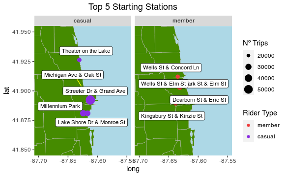
| 6 | casual | Streeter Dr & Grand Ave | 41.892278 | -87.612043 | 56879 |
| 7 | casual | Millennium Park | 41.881031 | -87.624084 | 31442 |
| 8 | casual | Michigan Ave & Oak St | 41.90096 | -87.623776 | 27898 |
| 9 | casual | Lake Shore Dr & Monroe St | 41.880958 | -87.616743 | 27148 |
| 10 | casual | Theater on the Lake | 41.926277 | -87.630834 | 22061 |
– Casuals: Theater on the Lake, Michigan Ave. & Oak St., Streeter Dr. & Gradn Ave., Millennium Park and Lake Shore Dr. & Monroe St..
– Members: Wells St. & Concord Ln., Wells St. & Elm St., Park St. & Elm St., Dearborn St. & Erie St. and Kingsbury St. & Kinize St..
2.5- Top 5 ending geolocations for members:
members_end_geo <- sqldf("SELECT member_casual, end_station_name AS End_Station,
                end_lat AS End_Latitude,
                end_lng As End_Longitude, COUNT(end_station_name) AS Num_Trips
                FROM df
                WHERE end_station_name IS NOT ''
                AND member_casual = 'member'
                GROUP BY end_station_name
                ORDER BY COUNT(end_station_name) DESC
                LIMIT 5",
method = "auto")
2.6- Top 5 ending geolocations for casuals:
casuals_end_geo <- sqldf("SELECT member_casual, end_station_name AS End_Station,
                end_lat AS End_Latitude, end_lng As End_Longitude,
                COUNT(end_station_name) AS Num_Trips
                FROM df
                WHERE end_station_name IS NOT ''
                AND member_casual = 'casual'
                GROUP BY end_station_name
                ORDER BY COUNT(end_station_name) DESC
                LIMIT 5",
method = "auto")
2.7- Merging members_end_geo + casuals_end_geo tables:
end_all_geo <- rbind(members_end_geo, casuals_end_geo)
View(end_all_geo)
| member_casual | End_Station | End_Latitude | End_Longitude | Num_Trips | |
|---|---|---|---|---|---|
| 1 | member | Clark St & Elm St | 41.902973 | -87.63128 | 24487 |
| 2 | member | Wells St & Concord Ln | 41.912133 | -87.634656 | 21865 |
| 3 | member | Kingsbury St & Kinzie St | 41.88917683258 | -87.6385057718 | 20785 |
| 4 | member | Wells St & Elm St | 41.903222 | -87.634324 | 19566 |
| 5 | member | Dearborn St & Erie St | 41.893992 | -87.629318 | 19114 |
| 6 | casual | Streeter Dr & Grand Ave | 41.892278 | -87.612043 | 59046 |
| 7 | casual | Millennium Park | 41.8810317 | -87.62408432 | 32614 |
| 8 | casual | Michigan Ave & Oak St | 41.90096039 | -87.62377664 | 28979 |
| 9 | casual | Lake Shore Dr & Monroe St | 41.880958 | -87.616743 | 25667 |
| 10 | casual | Theater on the Lake | 41.92625 | -87.6309358333333 | 23819 |
– Casuals: Theater on the Lake, Michigan Ave. & Oak St., Streeter Dr. & Gradn Ave., Millennium Park and Lake Shore Dr. & Monroe St..
– Members: Wells St. & Concord Ln., Wells St. & Elm St., Park St. & Elm St., Dearborn St. & Erie St. and Kingsbury St. & Kinize St..
3- Geolocation map of the top 5 start and end stations
###Getting a shapefile of Chicago, and fortifying it into a dataframe
-Changing the decimal point to a comma for our plots:
start_all_geo$Start_Latitude = as.numeric(gsub(",",".",start_all_geo$Start_Latitude,fixed=TRUE))
start_all_geo$Start_Longitude = as.numeric(gsub(",",".",start_all_geo$Start_Longitude,fixed=TRUE))
end_all_geo$End_Latitude = as.numeric(gsub(",",".",end_all_geo$End_Latitude, fixed=TRUE))
end_all_geo$End_Longitude = as.numeric(gsub(",",".",end_all_geo$End_Longitude, fixed=TRUE))
-Getting a shapefile of Chicago, and fortifying it into a dataframe: Source: https://data.cityofchicago.org/
chicago_map <- readOGR(dsn="/home/david/Documents/Google_course/Course/Case 1/map_chicago", layer="geo_export_8079d6b6-c882-4cf2-8acb-20d99ac6850f")
chicago_df = fortify(chicago_map)
3.1- Start station geolocations:
start_map <-ggplot() +
    geom_polygon(data = chicago_df, aes(x = long, y=lat , group = group), colour = 'grey',
    fill = 'chartreuse4', size = .2) +
    geom_point(data = start_all_geo,
             aes(x = Start_Longitude, y = Start_Latitude, size = Num_Trips, color = member_casual),
             alpha = 1) +
    geom_label_repel(data = start_all_geo,
                   aes(x = Start_Longitude, y = Start_Latitude, label = Start_Station),
                   size = 3,
                   box.padding   = 0.4,
                   point.padding = 0.65,
                   segment.color = 'yellow') +
  scale_colour_manual(values=c(member = 'brown2',  casual= 'blueviolet'))+
  facet_wrap(~member_casual) +
  labs(title = "Top 5 Starting Stations", size = 'Nº Trips',
       color = 'Rider Type') +
  coord_cartesian(xlim = c(-87.7, -87.55), ylim = c(41.85, 41.95))+
  theme(plot.title = element_text(hjust = 0.5)) +
  theme(panel.background = element_rect(fill = "lightblue")) +
        theme(panel.border = element_blank(),
        panel.grid.major = element_blank(),
        panel.grid.minor = element_blank())
start_map
3.2- End station geolocations:
end_map <- ggplot() +
    geom_polygon(data = chicago_df, aes(x = long, y=lat , group = group), colour = 'grey',
    fill = 'chartreuse4', size = .2) +
  geom_point(data = end_all_geo,
             aes(x = End_Longitude, y = End_Latitude, size = Num_Trips, color = member_casual),
             alpha = 1) +
  geom_label_repel(data = end_all_geo,
                   aes(x = End_Longitude, y = End_Latitude, label = End_Station),
                   size = 3,
                   box.padding   = 0.4,
                   point.padding = 0.65,
                   segment.color = 'yellow') +
  scale_colour_manual(values=c(member = 'brown2',  casual= 'blueviolet')) +
  facet_wrap(~member_casual) +
  labs(title = "Top 5 Ending Stations.", size = 'Nº Trips',
       color = 'Rider Type') +
  coord_cartesian(xlim = c(-87.7, -87.55), ylim = c(41.85, 41.95)) +
    theme(plot.title = element_text(hjust = 0.5)) +
    theme(panel.background = element_rect(fill = "lightblue")) +
    theme(panel.border = element_blank(),
    panel.grid.major = element_blank(),
    panel.grid.minor = element_blank())
end_map

We can observe the Top 5 ending and starting stations are the sames.
4- Tracing the different results obtained
-First, we are going to replace the numerical values with names of weekdays:
day_week_total$day_of_week[day_week_total$day_of_week == "1"] <- "Sunday"
day_week_total$day_of_week[day_week_total$day_of_week == "2"] <- "Monday"
day_week_total$day_of_week[day_week_total$day_of_week == "3"] <- "Tuesday"
day_week_total$day_of_week[day_week_total$day_of_week == "4"] <- "Wednesday"
day_week_total$day_of_week[day_week_total$day_of_week == "5"] <- "Thursday"
day_week_total$day_of_week[day_week_total$day_of_week == "6"] <- "Friday"
day_week_total$day_of_week[day_week_total$day_of_week == "7"] <- "Saturday"
4.1- Stacked bar plot with the yearly modes for all riders
**-Let’s to create a function in the order I established so that x axis isn’t sorted. This function finds the sum of casual and member riders, to be used to plot labels in the middle of each bar.
day_week_total$day_of_week <- factor(day_week_total$day_of_week, levels = rev(unique(day_week_total$day_of_week)), ordered=TRUE)
day_week_total <- day_week_total %>%
  arrange(day_of_week, rev(member_casual)) %>%
  group_by(day_of_week) %>%
  mutate(GTotal = cumsum(Total) - 0.5 * Total)

View(day_week_total)
| day_of_week | member_casual | Total | GTotal | |
|---|---|---|---|---|
| 1 | Sunday | member | 337639 | 168819.5 |
| 2 | Sunday | casual | 420590 | 547934 |
| 3 | Monday | member | 364920 | 182460 |
| 4 | Monday | casual | 250565 | 490202.5 |
| 5 | Tuesday | member | 400580 | 200290 |
| 6 | Tuesday | casual | 242367 | 521763.5 |
| 7 | Wednesday | member | 407021 | 203510.5 |
| 8 | Wednesday | casual | 241960 | 528001 |
| 9 | Thursday | member | 390808 | 195404 |
| 10 | Thursday | casual | 247971 | 514793.5 |
| 11 | Friday | member | 396755 | 198377.5 |
| 12 | Friday | casual | 322484 | 557997 |
| 13 | Saturday | member | 390260 | 195130 |
| 14 | Saturday | casual | 499152 | 639836 |
yearly_plot <- ggplot(data = day_week_total, aes(x = day_of_week, y = Total, fill = member_casual)) +
             scale_fill_manual(values=c(member = 'brown2',  casual= 'blueviolet')) +
  geom_col() +
  geom_text(aes(y = GTotal, label = Total), vjust = 1.5, colour = "white") +
  labs(title = "Total rides per day of week from 2020-09 to 2021-08", x = "Day of Week",
       y = "Total Rides", fill = "Rider Type") +
  scale_y_continuous(labels = function(x) format(x, scientific = FALSE)) +
      theme(plot.title = element_text(hjust = 0.5))
yearly_plot
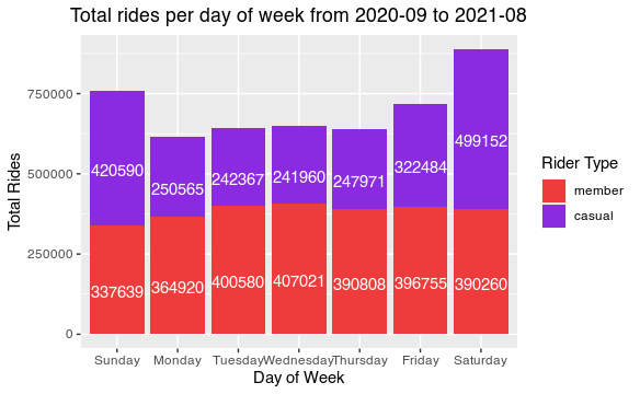
We can see that the weekend casual users increase.
4.2- A side by side bar plot with Total Rides vs. Rideable Type for all riders
-Build a query to return results related to rideble types by members:
bike_type <- sqldf("SELECT rideable_type, member_casual, COUNT(rideable_type) as number_of_uses
                 FROM df
                 GROUP BY member_casual, rideable_type
                 ORDER BY count(rideable_type) DESC",
method = "auto" )

View(bike_type)
-Removing the underscore in rideable types:
bike_type$rideable_type[bike_type$rideable_type == "classic_bike"] <- "Classic Bike"
bike_type$rideable_type[bike_type$rideable_type == "docked_bike"] <- "Docked Bike"
bike_type$rideable_type[bike_type$rideable_type == "electric_bike"] <- "Electric Bike"

View(bike_type)
| rideable_type | member_casual | number_of_uses | |
|---|---|---|---|
| 1 | Classic Bike | member | 1363298 |
| 2 | Classic Bike | casual | 925249 |
| 3 | Electric Bike | member | 821653 |
| 4 | Electric Bike | casual | 755623 |
| 5 | Docked Bike | casual | 544217 |
| 6 | Docked Bike | member | 503032 |
bike_type_plot <- ggplot(data = bike_type, aes(x = rideable_type, y = number_of_uses, fill = member_casual)) +
  scale_fill_manual(values=c(member = 'brown2',  casual= 'blueviolet')) +
  geom_col(position = "dodge") +
  geom_text(aes(label = number_of_uses),  vjust = -0.3 ,colour = "black",
            position = position_dodge(.9)) +
  labs(title = "Total Rides Per Rideable Type from 2020-09 to 2021-08", x = "Rideable Type",
       y = "Total Rides", fill = "Rider Type") +
  scale_y_continuous(labels = function(x) format(x, scientific = FALSE)) +
      theme(plot.title = element_text(hjust = 0.5))
bike_type_plot
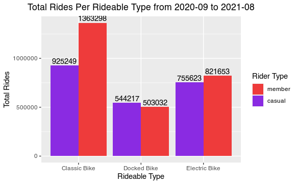
Classic bikes are preferred by users, especially by members.
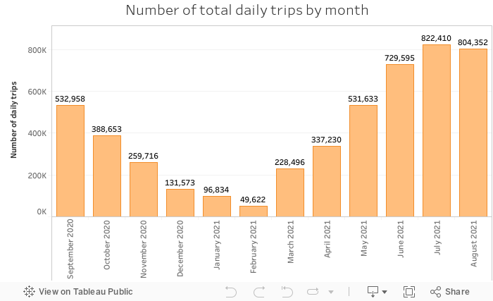
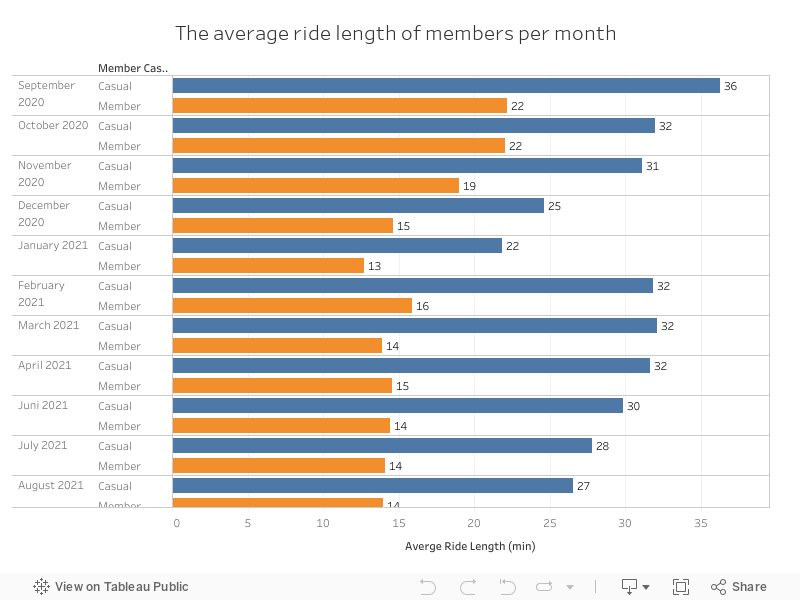
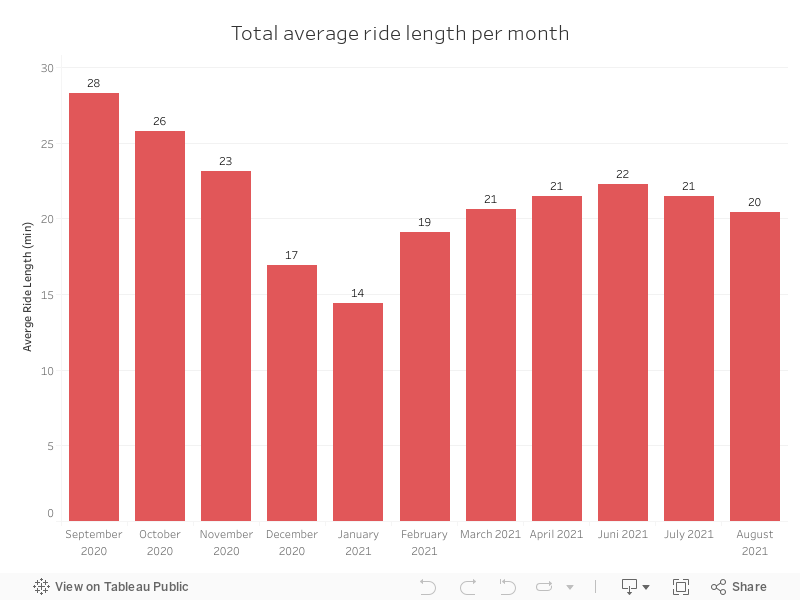
Tableau Pivot Tables
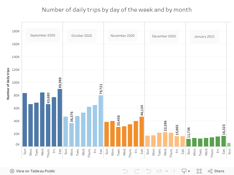
One the hand, casual users are the ones who travel the most distance in any month of the year studied. Highlighting the month of September with 36 minutes on average and January with 22. On the other hand, the members are more stable.
We can also see from September to November how the distance traveled is usually greater. New year and new purpose of cycling to work or school?
We doble check that September is the month with the highest average time traveled, this time decreases as winter progresses and gradually picks up again until summer.
We can see how the summer months are the months with the highest number of trips, especially Saturdays. This, together with what was observed in the previous graphs, can make us indicate that people in summer travel shorter journeys than in autumn.
We verify that the bulk of the trips are made in the months of June, July and August.